PAKA
Brand Refresh
PAKA needed a style update for their brand guide, as the original version that launched the company had become outdated. The brand, rooted in adventure and cultural resonance, called for a more cutting-edge and contemporary aesthetic. The color palettes and typefaces had previously lacked coherence and clear direction.
To address these issues, we conducted iterations to distill the essential elements. We examined what had been successful, consistently used, and visually appealing in previous campaigns and product releases. With all these considerations in mind, I crafted a visual framework that serves as the cornerstone of the brand, designed to accommodate the company's visual growth. This framework keeps the brand modern, clean, and up to par with competitors in the space while allowing for identity growth as time progresses.
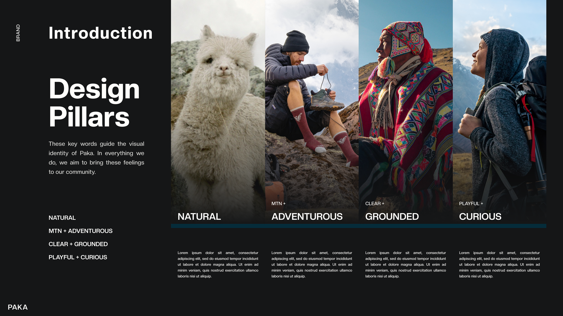
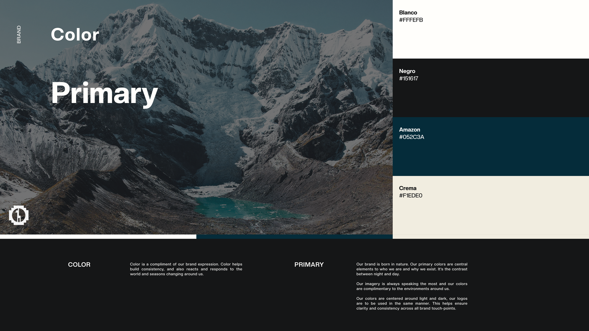
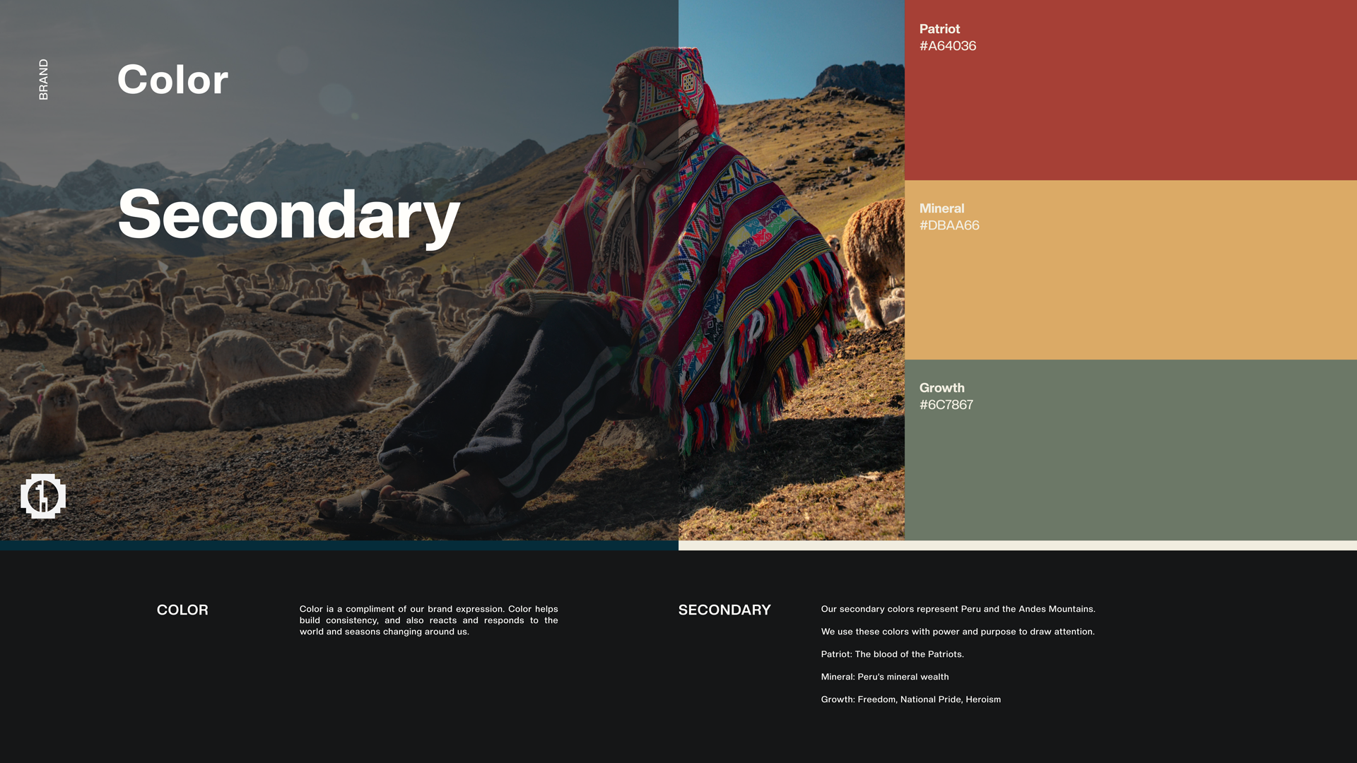
Featured: Select pages from the new brand guide.


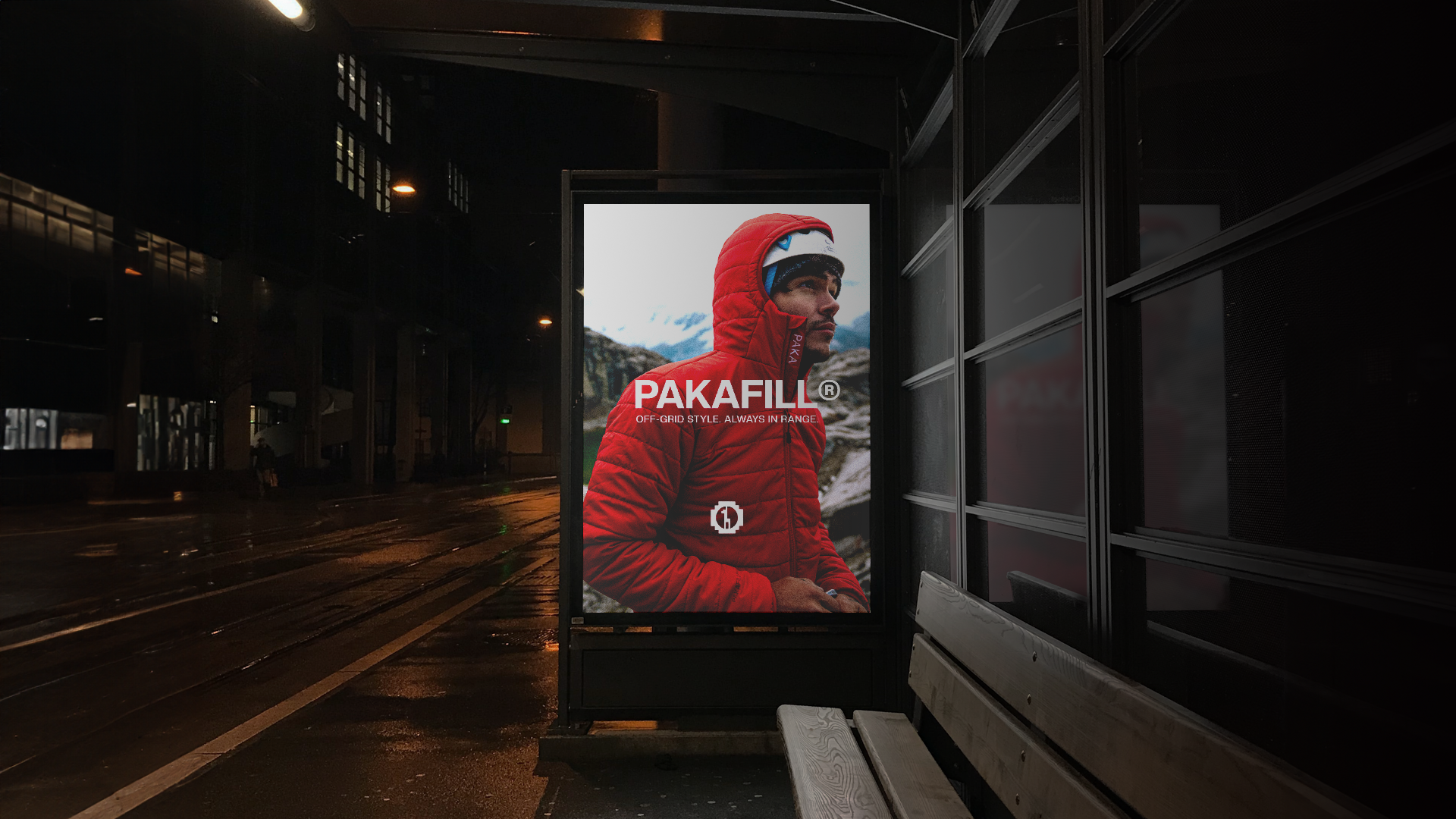
Social Media / Ad Sample